
आपले स्वप्नाचे घर अनेक पिढ्यांपर्यंत चालले पाहिजे
उत्तम गुणवत्तेचे सिमेंट वापरा


Ways to inject colour into your home- with the hottest colour palette of 2019
Bold colours make a great addition to your interiors, but these colours may intimidate quite a few people due to their bright presence. They work well into a variety of different styles and provide a pop of colour to an accent wall or an otherwise mundane interior. Here, we take a peek at how we can incorporate bold colours into your home in some creative ways.
The secret to success here is to see how much of a change you are willing to make. From major renovations to minor additions, and accent pieces, there is a multitude of ways to work bold colour into your home.
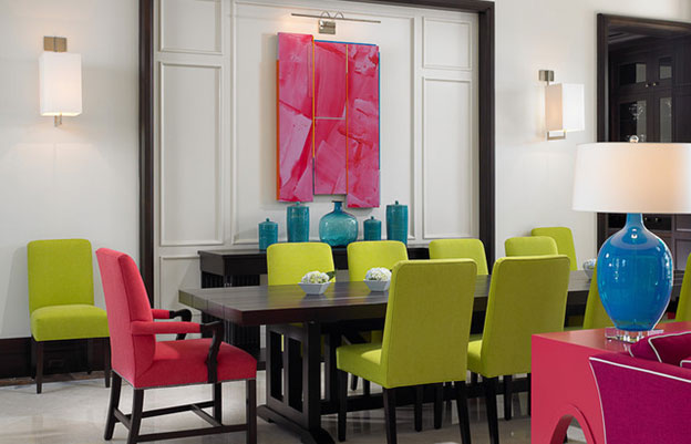
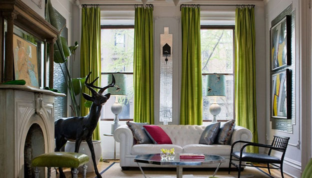
1. Decoration:
Bold colours make bold statements, which is why we can apply them in various situations in doses that make the most sense in that space. A big no is to add bold colour onto your walls as well as your furniture and accent elements, this may lead to an obtuse saturation of colour and make the appearance look gaudy. You need to make sure that you make responsible decisions that convey your taste in a tasteful manner.
For example, add in bold colours through elements which are least expected, such as textile, curtains, furniture, and throw pillows, etc. This is a way to subtly embark on a colour scheme journey. Sometimes all it takes is a strong statement piece which anchors the whole room, like a bold coloured rug, a brightly coloured lighting fixture or even a grand armchair. Do not make the mistake of indulging in timid choices like adding small decorative pieces in order to bring in bright colour; rather invest in big pieces that make a strong additive to your colour narrative.
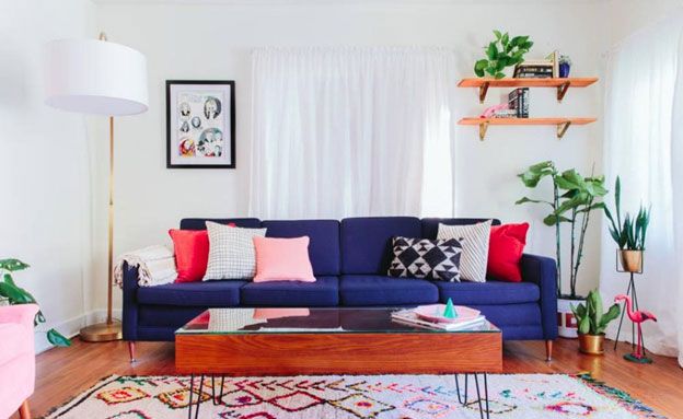
2. Less may be more:
While making our chosen space bold and bright, we may tend to go overboard. There is a myriad of bold colour choices in the market and they may all very well be tempting to you as the homeowner. Stick to no more than two to three colors for your interiors. Adding bold colours one by one can give you a great sense of control while giving you a better understanding of the space in the end. Don't make it too playful, unless you want to overwhelm your senses with too much colour.
Bold colours make a statement but too many in one area may cause visual confusion. For example, you may have gone with one colour for your drapes, in which case you don't need to add the same colour to the art and the furniture, as appealing as the colour may seem, too much of a good thing can be bad.
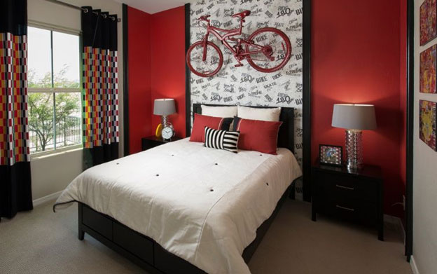
3. Accentuate:
After you have decided where to add the bold colours of your choice, the next step is to make sure they get their due. After all, it makes natural sense to think that bold colours will draw attention to where ever they are applied. But the lack of natural light, and dim interior artificial lighting, as well as lack of neutral colour to add balance, may lead to the bold colour not making a visual impact.
Accent walls will shine when they are in a room with good light from generous windows. Tasteful application of bright colours usually requires proper contrast. Like a neutral colour taking up a majority of the visual space. Even a colour as simple as white will go a long way to help your bold accents shine. Most people don’t realise that whites come in a lot of different undertones, so choose the undertone that shows your accent colour the best.
4. Scale:
Paying attention to proportion and scale is an important factor in designing any room, but it becomes especially crucial when you’re dealing with bold shades. A rule of thumb to follow is to try and limit the number of accent colours for a smaller space and add more colors to a larger space. Based on the wall spaces and size in comparison to the rest of the room, there should be a few omissions in bold colour additives.
As an example, a bold accent furniture piece doesn’t need to have a matching wall in the same room, since the wall could easily overshadow it, especially in a smaller room. You should really be aware of which possibilities of colour combinations complement a space as opposed to which will overtake a space and make it appear garish.
5. Choose the right colours:
With the New Year, there are new trends, especially in colours along with the Pantone colour of the year being living coral, which is set to make an impact in all things design in the coming year. There are other colours to look out for as well
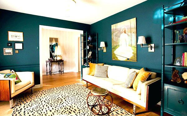
-Deep greens:
We have progressively seen the green colour take over everything from wallpaper to decor, The deep jewel tone green is a great colour to embrace. Choose warm metal colours such as gold or copper to complement this colour and it will reward you with a sense of luxury and opulence in your space.
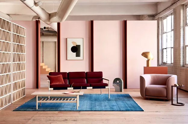
-Light pinks:
This colour also goes by the name millennial pink, and it has endured all of 2018 and is here to stay for the rest of 2019 as well. This colour is bold while still being easy on the eyes, making it a blessing for those who want to make a statement while treading shallow waters. This dusty pink pair well with the rose gold trend which is another trend set to carry on to the next year, as well as brushed silver accessories. If you want to make a statement, pair this with other dusty pastels for a very insta-era ready interior.
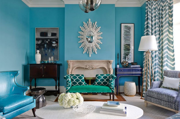
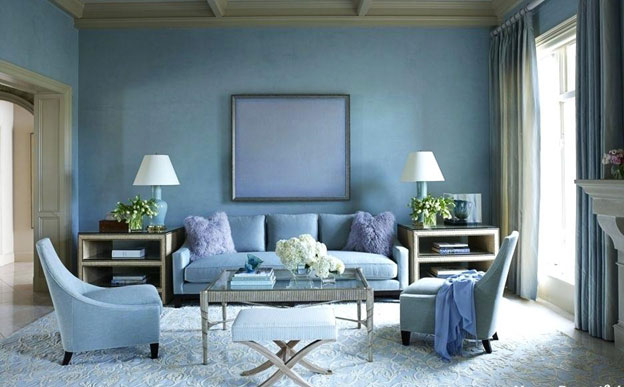
-Medium blues:
Blue is such a versatile colour especially in the range of shades it is available in, from deep jewel sapphires to light sky blue. But the trend this year will be straddling the middle of the line blues, true blues that can be used as a great middle of the road alternative to the spectrum of light to deep shades.
If you enjoy bold colours, take these as your guidelines to use them in your home today. Breathe instant life into your interior spaces with a balance of colour and accessories that will add fresh life in the New Year.
Image Sources
Image source: https://houseofgracedesign.files.wordpress.com/2016/01/tropical-dining-room.jpg?w=640fd0fb1ae6cfa99e54f660/1532053095415/Tableau+Kitchen+System+by+Cantilever+DesignOffice+Melbourne+Australia.jpg?format=1500w
Image source: https://freshome.com/wp-content/uploads/2017/12/2018-colors.jpg
Image source: https://cdn.homedit.com/wp-content/uploads/2011/11/teen-age-boy-bedroom-red-color-themed.jpg
Image source: https://www.impressiveinteriordesign.com/wp-content/uploads/2016/02/Ideas-For-Decorating-Your-Homes-Interior-With-Bold-Colors5-768x511.jpg
Image source: https://www.impressiveinteriordesign.com/wp-content/uploads/2016/02/Ideas-For-Decorating-Your-Homes-Interior-With-Bold-Colors5-768x511.jpg
Image source: http://trasher.info/wp-content/uploads/2018/08/colours-for-living-room-walls-teal-living-room-design-ideas-trendy-interiors-in-a-bold-color-living-room-colour-combinations-walls.jpg
Image source: https://cdn.apartmenttherapy.info/image/fetch/f_auto,q_auto,w_750,c_fit,fl_strip_profile/https://s3.amazonaws.com/pixtruder/original_images/608653c75253b421ec20456cbe55078cb881eef8
Image source: http://photopage.info/wp-content/uploads/2018/04/large-size-of-living-room-colors-casual-dining-decorating-ideas-bold-color.jpg
Ar. Mrudula Reddy
Master of Landscape Architecture Back
Back